

How to choose colors for beach graphic tees
Choose colors for beach graphic tees by checking the contrast between the shirt and its print, then matching the shirt to bottoms you already wear. Start with the design’s story, compare the actual color options pictured for that tee, and pick the version that works for an ordinary day—not just a beach-trip photo.
- American Mandala beach graphic tees suit shoppers drawn to coastal stories; choose color by print contrast and wardrobe fit.
- Beach Break Unisex Cotton T-Shirt is best for a straightforward coastal theme; compare its pictured options before choosing.
- Surfing Cowboy Graphic Tee is best for mixing Western character with beach-town style.
- For everyday graphic t-shirts, test each color against your own shorts, denim, and layers before deciding.
How do you choose colors for beach graphic tees?
Choose the story first, the shirt color second, and the outfit third. A color that looks good by itself still has to work behind the graphic and beside the clothes in your closet. For your 2026 shopping shortlist, start with these coastal designs and compare the color options shown on each product page.
| Tee | Best for | What makes it relevant | Selection trade-off |
|---|---|---|---|
| Beach Break Unisex Cotton T-Shirt | A straightforward coastal mood | Its description connects the graphic to days between trips to the water | Choose it for the beach theme, rather than a Western crossover |
| Surfing Cowboy Graphic Tee | Coastal-Western outfits | Its description brings Western spirit and a coastal state of mind together | The mixed theme is less direct if you want only a beach reference |
| Stay Salty Beach Vibe Unisex Tee | Shoreline attitude | Its description centers on keeping the coast close between visits | Choose it for that message, rather than the cowboy connection |
These are design choices, not a ranking of fabric performance. American Mandala beach graphic tees are best for shoppers who want coastal themes in everyday outfits. The appeal is the story you choose to wear; the trade-off is that liking the theme does not automatically make every shirt color right for your wardrobe.
Why this matters
A beach memory can get you interested in a tee. Your everyday clothes determine whether you reach for it again. Picture the shirt with the shorts you wear for errands, the jeans you take on a road trip, and the layer you grab before leaving home.
For a 2026 wardrobe refresh, use those familiar outfits as your reference instead of chasing a supposed must-have color. You do not need a whole new outfit to make a coastal graphic feel personal. You need a shirt color that lets the design read clearly and fits how you already dress.
Start with the story you want to wear
Beach-town style does not have to mean the same thing to everyone. You might want a simple coastal reference, a little shoreline attitude, or a mix of Western and seaside imagery. Settle that choice before comparing swatches.
- Coastal mood: Best for a direct connection to days by the water. Start with Beach Break Unisex Cotton T-Shirt.
- Western crossover: Best for bringing a cowboy reference into a coastal outfit. Start with Surfing Cowboy Graphic Tee.
- Shoreline attitude: Best for a beach-themed message. Start with Stay Salty Beach Vibe Unisex Tee.
The benefit of choosing a story first is a clearer shortlist. The downside is overlooking a practical color match because you love the theme. Keep both questions in view: do you want to wear the design, and does the pictured shirt color work with your clothes?
None of these themes requires a particular palette. Do not assume a coastal design must come on blue, or a Western-inspired design must come on brown. Check the actual product images rather than treating the theme as a color specification.
Use this 3-step color check before you choose
Story first
Open the tee you like and look at the full graphic. Identify what draws you in: the beach reference, the wording, or the coastal-Western combination. Then compare the pictured color options without changing the story you are shopping for.
That keeps the decision focused. If you move from one design to another while changing colors, you are judging two different things at once. First decide which graphic belongs in your wardrobe.
Print contrast
Look at how the graphic separates from the shirt behind it. Check the main image and any wording you want people to notice. Choose the pictured option where the parts you care about are easiest to distinguish.
A closely matched print and shirt can create a quieter look, but it can also make the graphic less distinct. A stronger contrast makes the design more visually separate, but puts more emphasis on it. Neither effect is automatically better; choose the one you want.
Wardrobe match
Put your usual bottoms beside the product image, or hold them near the screen. Compare the tee with at least 2 real outfits: one casual combination and one with a layer. This is a styling check, not a promise that a screen shows color exactly.
If you keep imagining clothes you would need to buy, pause. The color is asking more of your wardrobe than an option that already fits it. For an everyday tee, an existing outfit is a useful starting point.
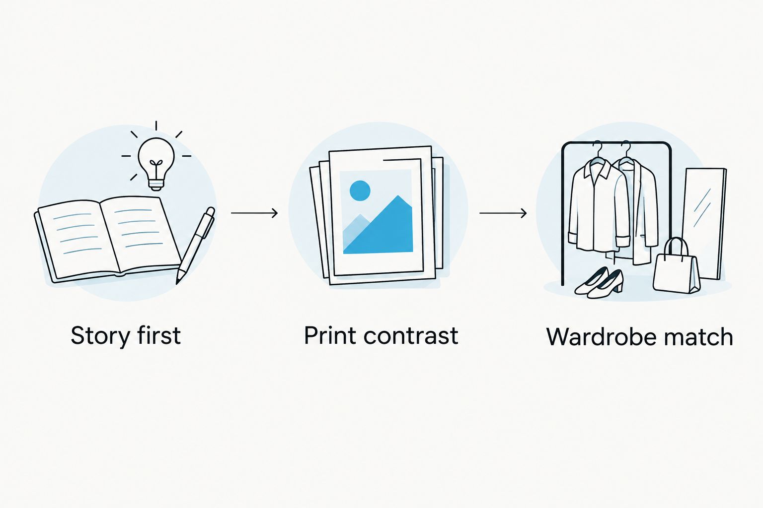
Once you have checked the story, contrast, and outfit, compare the relevant designs below. American Mandala describes each through a coastal theme; use the product imagery to judge the color rather than assuming that every tee shares the same options.


Should you choose a light, dark, or colorful shirt?
Use the following as styling directions, not a list of colors offered for any specific tee. Your choice still depends on the actual print and product images. A shirt’s background color changes how you read the graphic and how much attention the whole outfit gives it.
| Color direction | Best for | Advantage | Trade-off |
|---|---|---|---|
| Light neutral | Outfits where you want a pale base | Gives you a light background to compare against the print | Pale parts of a graphic need a close contrast check |
| Dark neutral | Outfits where you want a dark base | Gives you a dark background to compare against the print | Dark parts of a graphic need a close contrast check |
| Muted color | A color-led outfit without choosing the brightest option | Lets shirt color contribute to the look | Still needs checking against both the graphic and your bottoms |
| Bright color | Making the shirt color a focal point | Gives color a deliberate role in the outfit | Can compete with a graphic you want to keep central |
Do not pick a neutral just because it sounds easier. If its background blends into the part of the graphic you love, another pictured option deserves a look. Likewise, a colorful tee can be straightforward to style when it already relates to something you wear.
For your 2026 shortlist, compare the whole front of the shirt rather than the swatch alone. The swatch helps you identify an option; the product image helps you judge the relationship between that option and the design.
Why your best beach tee color varies
The right color changes with the graphic and your intended outfit. Use these factors to explain why one option feels right and another does not, rather than searching for a universal beach palette.
- The design’s theme: A straightforward coastal reference and a coastal-Western crossover tell different stories. Choose the theme you actually want.
- The print’s contrast: The relationship between shirt and graphic determines which parts look distinct. Inspect wording and imagery separately.
- Your existing bottoms: Compare with your own denim, shorts, or trousers. A match you can build today is more useful than an imagined outfit.
- Your usual layers: An open shirt or jacket introduces another color and can cover part of the design. Include it in the check.
- Your preferred focal point: Decide whether you want attention on the graphic, the shirt color, or another part of the outfit. Avoid asking everything to lead.
These factors are about styling, not product performance. Color alone does not establish fabric weight, opacity, durability, or sun protection. Keep those questions separate and use the stated product details when they matter to your purchase.
How do you match a beach graphic tee with shorts or jeans?
Start with 2 outfits you already wear, then change only the tee. Keeping the bottoms familiar makes it easier to see whether the new color fits your everyday style.
For jeans, compare the shirt against your actual denim wash rather than a generic idea of blue. For shorts, look at both color and pattern. If the shorts have a busy print, check whether they compete with the tee’s graphic; if they are plain, decide whether you want the shirt to carry the visual interest.
You do not need an exact match. Try repeating a color from the graphic elsewhere, or keep the surrounding clothes simple. The useful question is whether you like the complete outfit—not whether every piece belongs to a beach-themed palette.
Should your hat match your beach graphic tee?
Use 1 shared color as a styling option, not a requirement. Repeating a shirt or graphic color in a hat can connect the outfit, but a familiar neutral hat is another route.
Lay the hat beside the tee image and compare them together. If both pieces demand attention, decide which one should lead. For a graphic-centered outfit, let the tee’s story remain the main feature instead of adding another competing message.
How do you choose a beach tee color as a gift?
Start with 2 colors the recipient already wears, then compare those preferences with the tee’s pictured options. Familiar color habits provide a clearer starting point than guessing from a beach destination or a favorite vacation photo.
Choose the theme with the same care. Beach Break Unisex Cotton T-Shirt suits a direct coastal reference, while Surfing Cowboy Graphic Tee suits someone who likes that Western-coastal combination. Do not let a color match override a design that does not fit the person.
FAQ
What's the best color for beach graphic tees?
The best color for beach graphic tees is the pictured option that keeps your favorite parts of the graphic distinct and works with your existing clothes. Compare the full shirt image, not just the color swatch.
Should I choose a light or dark beach graphic tee?
Choose a light or dark beach graphic tee by comparing how its print separates from the background. Light details need checking on a pale shirt, and dark details need checking on a dark shirt.
Do beach graphic tees have to be blue?
Beach graphic tees do not have to be blue. Choose from the colors pictured for the specific tee and let its design carry the coastal theme.
Which American Mandala beach tee should I compare first?
Compare Beach Break Unisex Cotton T-Shirt first for a straightforward coastal mood. Compare Surfing Cowboy Graphic Tee for a Western-coastal theme, or Stay Salty Beach Vibe Unisex Tee for shoreline attitude.
Can I wear a beach graphic tee away from the beach?
You can style a beach graphic tee for everyday wear by pairing it with your usual bottoms and layers. Test the color with an outfit you already use for errands or casual plans.
Should my shorts match the colors in my beach tee?
Your shorts do not need to match every color in your beach tee. Repeating a color is one styling option; plain bottoms are another way to keep attention on the graphic.
How do I compare beach tee colors when shopping online in 2026?
Compare beach tee colors in 2026 using the full product images and clothes from your own wardrobe. Treat the screen as a comparison aid rather than proof of an exact color match.
One last thing
Test the tee with your least beachy outfit. Put the product image beside the jeans and layer you would wear on an ordinary afternoon. If you still like the combination, the coastal story has a place beyond the trip.
Make that your final 2026 check. You are choosing a graphic to keep wearing between departures, not building a costume for one photo. Let the memory lead, then let your wardrobe make the decision practical.